Thursday, February 17, 2011

Motos Y Motores Logos

These are logos I made for a venture motorcycle sales company based in Havana Cuba. They are a sleek new company that fixes old motorcycles and sales them to the public. Motorcycles and scooters are rare in Cuba because of their price but an extremely useful commodity.


Saturday, February 12, 2011

Switzerland Photography

I had the awesome opportunity to explore Switzerland a few summers ago and here are a few rad photos i took. The beauty was there all I had to do was capture it.


2d design and Paintings

Here is a few paintings and 2d design projects I've done. The photo quality isn't too good but you get the idea. I enjoy painting, drawing, photography, and painting.


Book Cover Design

One of my favorite books is the Count of Monte Cristo by Alexander Dumas. The book cover on this book is either none existent or is a general cover produced by the publisher. So I wanted to take a crack at re-designing it using some photo I had and giving it a bigger title with a more appropriate type face.

Pictograms

Pictograms and signs are everywhere in our society. They communicate direct symbolism without the use of words. I wanted to create some of these and I chose a food theme. Each animal produces a delicious meat thus providing unity in the theme.

Type and Image

My goal was to find a quote that i could use to illustrate the meaning of a certain photo to create type and image continuity. I chose this quote that has to deal with slapping and tried to show a hand in motion. I used the lines of the hands to create direction of the text as well.

Natural History Museum Brochure

This Project was rad. The project was to make a brochure for a museum. I chose the Natural History Museum of London. I research the museum and found out their most popular exhibits as well as what made the museum unique, the architecture both inside and outside the building. I wanted to make the brochure pop so on the cover I used a vivid image and added some typography to the title that would provide interest to the view and make them want to pick it up. I also made the entire brochure vibrantly colored as to give the feeling a family welcoming environment. The colors give a sense of what the animals look like and the photos give a sample of what visitors can expect.


Magazine Layout

Here are a few examples of magazine layouts I've created. One is a spread about the origins of the printing press and graphic arts. The other is three spreads about classic monster movie characters and their lives off the screen. Both spreads were created using Adobe Illustrator and InDesign.


Symbol, text, display design

My goal on this project was to chose a Greek symbol, in this case Lambda, and try to emphasize the symbol in one comp, the text in the other, and the display design in the other. This was also a chance for me to explore different designs with the copy and how it would relate to the overall design.


Typograms

Playing around with different words and font styles, i came up with a few different typograms. I didn't want to illustrate too much, I was set on seeing what I could do by just manipulating a few of the letterforms to create each word's meaning.


Branding Downtown Logan Utah

A group of my colleagues and I were given the task of re-branding the downtown district of Logan Utah. The downtown area has many shops and restaurants as well as a historical district. The Logan Downtown Alliance wanted to re-brand the city in order to attract more people downtown including making Logan a vacation destination for tourists and not just a gateway to other outdoor adventure towns.

My group and I decided to brand downtown after local folklore, the legend of Old Ephraim. Old Ephraim was the biggest bear every recorded and it was killed in Logan canyon around the turn of the century. We decided to give the downtown are that feel by giving shop owners the opportunity to purchase artistic bear statue they could put outside their store. We suggested that shop owners create merchandise revolving around the bear.

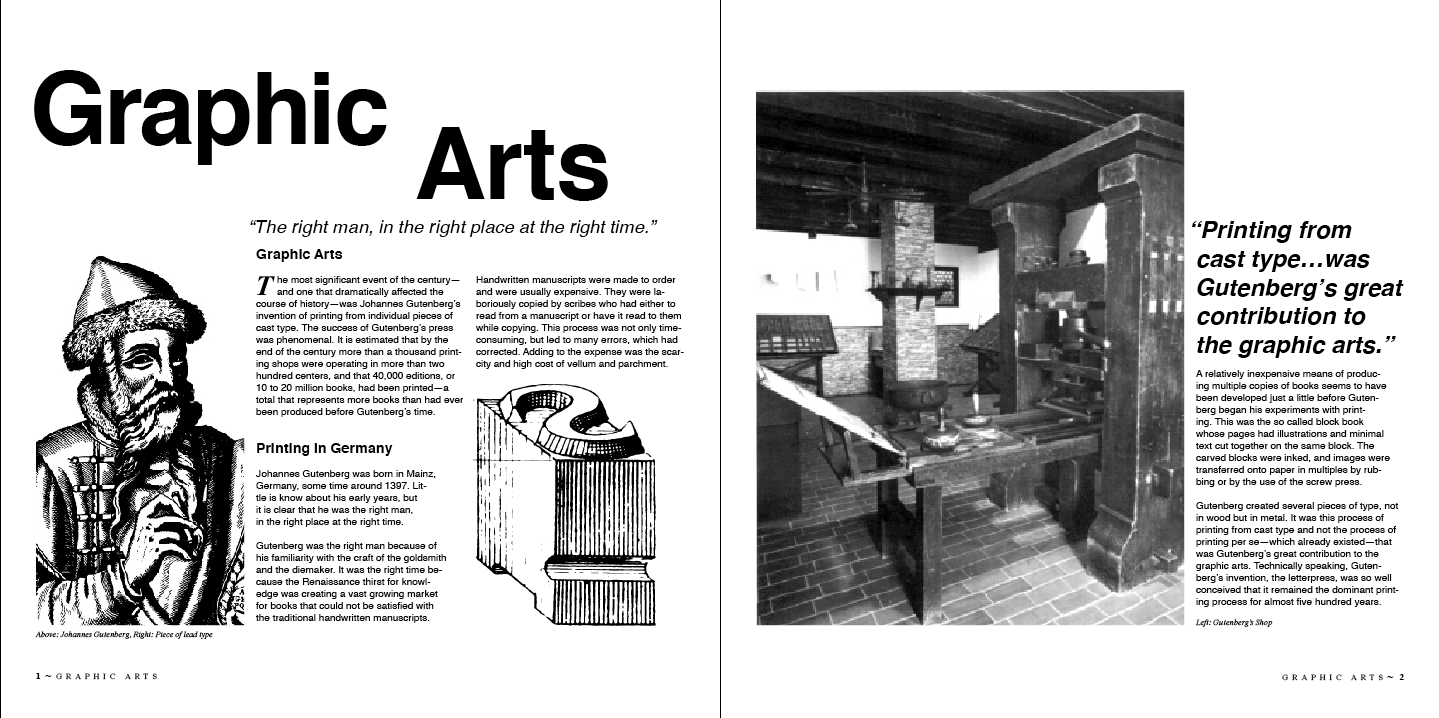
The big idea we came up with in order to attract visitors downtown was to create a plaza filled with shops, restaurants and outdoor gear and demonstration shops because Logan and the surrounding area is an outdoor sports Mecca. Right now, rock climbing is the big hobby among all of Logan's residents and students of Utah State University. In the center of this plaza will be a 75ft. rock climbing wall shaped as a bear standing on two legs. This plaza will not only make people aware of local culture and folklore but it will attract students, families and visitors from around Utah to come and explore Logan and climb the bear. Below are examples of logos, bumper stickers,  a banner example, a brochure and a vision of what this would look like. Downtown Logan would effectively accomplish its goal of bring more people downtown by using this branding idea and strategy.


Whiskit!

My groups job was to create a software company using something that people need in everyday life. We decided to make a software company that would be a large database for recipes and nutrition advice. The primary feature of the software was that you could input any ingredients that you had in your kitchen, and the software would provide you with recipes that you could use using only those ingredients. The software's purpose was so that you didn't have to go to the store to pick up ingredients. You could just enter them into the site and it would give you recipes on what to make with those specific ingredients.

I designed the logo to capture these elements of the company. We wanted it to be perceived as fresh, wholesome, and easy to use. I designed the logo to take on a whisk type feel. The name whiskit refers to  the process of putting several ingredients together to create something, and that is what the software does. We tried to make the name pithy so that it would be easy to remember and people could say "I whiskedit!," kind of like "I googled it!".

Personal Branding Logo

I wanted to make a personal branding logo for myself using my initials, ep, to create a type of monogram. I used a figure ground relationship to bring out the two initials. I wanted to try and do something other than just plop one initial in front of the other with a conventional typeface. So I decided to use a handwritten type face to create even more interest.

Boo at the Zoo Logo

The local zoo was holding an event called Boo at the Zoo for Halloween. It was a community wide event that invited families to come enjoy the zoo which at the time was Halloween themed. They wanted a logo that wasn't cliche that represented Halloween at the zoo but also looked family friendly.

Provenance

This is a logo I made for a financial conglomerate company that prides itself in financially backing start new small business. Their goal is to be perceived as a clean, sleek, innovative company. I tried to design this around those attributes hoping to symbolize Provenance's goal to bring new businesses to the top of the market.